Hi All,
On 14 Mar 2020 (Sat), I spoke on a Power BI and AI - The Kingdom of possibility.
In recent months, Power BI Team has released a couple of AI visuals in Power BI Desktop.
I will walk through each visual and there benefits.
Sample Power BI PBIX and Excel Datasets are stored here.
On 14 Mar 2020 (Sat), I spoke on a Power BI and AI - The Kingdom of possibility.
In recent months, Power BI Team has released a couple of AI visuals in Power BI Desktop.
I will walk through each visual and there benefits.
Sample Power BI PBIX and Excel Datasets are stored here.
Video:
Decomposition Tree Visual (Power BI Desktop)
Power BI Dataflow (Power BI Service Only)
There are many definitions about Power BI Dataflow
- Self-service data prep or Self-self ETL (Extract-Transform-Load)
- The way that is reusable & repeatable for others
- A collection of entities and entities are similar to tables
Definition
- Dataflow is simply Power Query in the cloud.
- Power Query process that runs in the cloud independently from any Power BI reports.
- Dataflows are used to ingest, transform, integrate, and enrich big data/AI
- A lot of ML capabilities are built on top of Dataflow. (More computation power on cloud than Desktop)
Step by Step to create a Dataflow
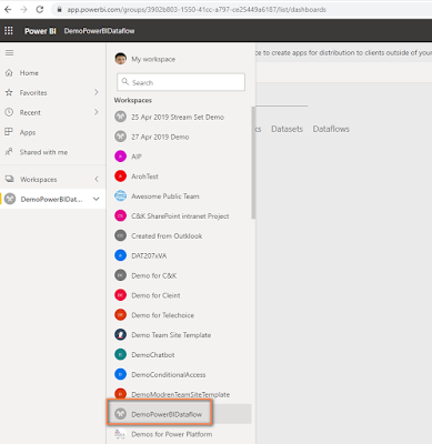
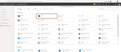
- Open browser window and type PowerBI.com
- Create a new App workspace or use an existing app workspace.
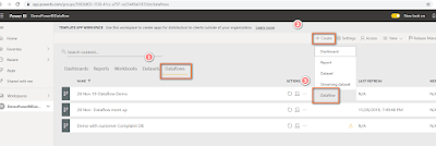
- Create a new Dataflow
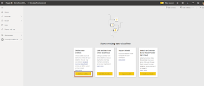
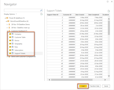
- Click on Add new entities
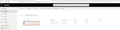
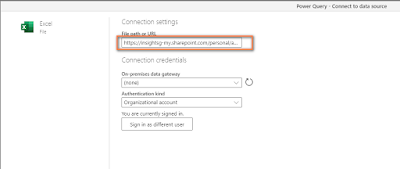
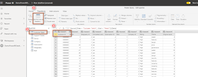
- I have already created a Customer Feedback Excel file in OneDrive for Business account
:
- Under the Power Query window of Power BI Dataflow, select Excel.
- Under Authentication, link dropdown use Organizational account
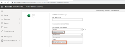
and type full URL for OneDrive Excel account
https://insightsg-my.sharepoint.com/personal/aroh_shukla_Insight_com/Documents/14Mar2020Datacamp/customerfeedback.xlsx
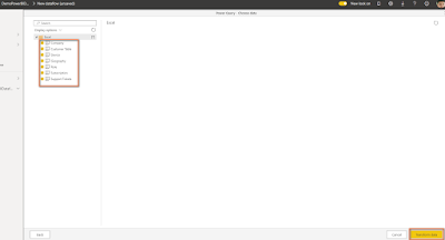
- Load all the tables and click on Transform data.
- You can do a basic transformation like User first row as headers for this dataset and do it for all rows.
- Click on Save & Close button.
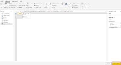
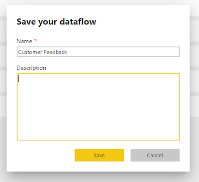
- Save the Dataflow.
- Open Power BI desktop >> Get Data >> Power BI dataflows.
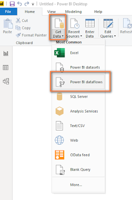
- Locate Customer Feedback and select all tables.
- Align Data Relationships in the Data Relationship view
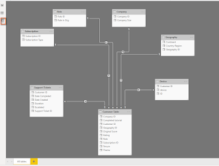
- Now, you can use the same Power BI Desktop's tools and techniques
Key Influencers Visual (Power BI Desktop)


:


and type full URL for OneDrive Excel account
https://insightsg-my.sharepoint.com/personal/aroh_shukla_Insight_com/Documents/14Mar2020Datacamp/customerfeedback.xlsx


- When to use key influencers
>> Factors affect the metric being analyzed.
>> Contrast the relative importance of these factors - How AI helps
>> Visual a couple of algorithms like ML.NET, One-hot encoding, Replace missing value, etc.
cc - Considerations
>> Direct Query is not supported
>> Azure Analysis Services and SSAS is not supported
>> Publish to Web is not supported
>> NET FX 4.6 above or higher is required.
>> Aggregates and measures are not supported. - It’s the 1st AI visual in Power BI.
- Finds patterns of your data to try and explain what influences your metric and value that goes up and down.
- Right now, it does not support measures.
- Note that its AI visual, the data set must have ample information so that AI can find patterns.
- USE CASE:
You are the Project Manager who is interested in looking into data about customers who are using our cloud service who have given low ratings. - SAMPLE DATASET - Let us check the dataset
COMPANY
The table shows the company size.
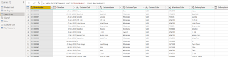
CUSTOMER TABLE(45 K rows)
Tables detail customer and company ID. Important rating column that Key Influencer value will use.
DEVICE (69 ROWS)
Provides devises information such as browser, mobile, tablet, etc.
GEOGRAPHY
ROLE
The role of a person in the organization
SUBSCRIPTION
The type of subscription.
SUPPORT TICKETS (126K rows)
Number of support tickets with customer and dates


STEP BY STEP
- Open the latest version of Power BI Desktop.
- Let’s drag the Key Influencer Visual. From the Customer table, drag the Rating in the Analyse column.
We have all the information about the customer who has given us a low or high rating
Note you have 2 tabs on Key Influencer Visual (KIV) called Key Influencers and Top Segments.
You also have a drop-down that influences the Rating (key measure) which has a value of High or Low.
We need to look for the factor that customers gave a low rating.
- Drag Country-Region column of Geography table and place under Explain by of KIV

- We
also, drag Role in Org from the Roles table,

Company size from the Company table, the theme they chose from the Customer table,

and subscription type from the Subscription table
- Notice that every time we drag a column in the Explain by column the Key Influencers visuals re-run the analysis based on factors that impact the low rating
- E.g. France was top the Influencers, but we add more dimensions and it looks like Role in Organisation as the consumer is the top Influencers.
- What
is the meaning of the consumer is key Influencer?

Let us dissect somebody is a consumer of cloud service of giving low rating is 2.5 times is higher if they are administrator or publisher.
Consumer rating is 14.93% and the average score is 5.78% of all roles (admins and publisher)
Likelihood of average score is 5.78% and 14.93% customer rating result in 2.57 times.
14.93 / 5.75 = 2.557 times
- Key Influencer
visual also considers the number of data points. It is a very important point.
- Note that the Administrator role also has a high value of low ratings of 13.42%

But the Administrator role is NOT showing up in Key Influencers visual at all
If we drag rating from Country Table, Role in Org from Role table and rating count from Country table. and rating column from Country Table.
Role in Org from Role Table

Drag rating column and rating count from Customer Table
and the number of counts for the administrator is much lower.
We are also able to compare different types of variables and rank them alongside each other. E.g. the 2nd influencer is Theme where usability rating is low, and the rating is 28.68% as compared to all other themes which are 11.35%
We can filter the ratings that we are driving low by checking the box – Only show values that are influencers.
By checking the box, we are presented with only 4 key factors that are giving low ratings.
Let’s check what happens if you look for company size. Drag Company size as the table

and make it as a slicer.
The consumer is not the lowest rating, but security becomes the key influencer for larger enterprises and consumer does not appear at all.
The Key Influencer Visual also works for the continuous fields as well. For example, we drag Tenure to the Key Influencer Visual • Tenure becomes the top influencer with rating is as low as 29.49% with an average score of 10.39%. That is leading to the likelihood of tenure to 29.49 / 10.39 = 2.8 times.
What does it mean? If tenure increases then the likelihood of a low rating also increases.
This means the customers who have been with us longer, are giving us a lower rating.
Let's look at the number of support tickets, and we want to see if the number of support tickets that customer impacts their likelihood of giving us a low rating.
Customers can have no support tickets, one support ticket or many support tickets.

Drag the Support Ticket ID to Key Influencers Visual

· We can see that when the count of support tickets goes up, the likelihood of receiving a low rating increases.The height of the bubble represents what proportion of that segment has low ratings.
Now, we have seen many factors that influence a specific attribute that effects. But we want to which segments are giving us a low rating then we have to move to the Top Segments tab.
The size of the bubble represents how many customers we have in a particular segment.
Let us click on Segment 1 bubble
· We see the customers who are not the publisher, and the number of support tickets is more than 4. The tenure is more than 29.
74% of the customer has given us a low rating.


Decomposition Tree Visual (Power BI Desktop)
The decomposition tree visual in Power BI lets you visualize data across multiple dimensions. It automatically aggregates data and enables drilling down into your dimensions in any order. It is also an artificial intelligence (AI) visualization, so you can ask it to find the next dimension to drill down into based on certain criteria. This makes it a valuable tool for ad hoc exploration and conducting root cause analysis.
Visual InputsAnalyze – metrics to analyzeExplain By: one or more dimensions you would like to drill down into.
AI splits
High Value: the highest value of the measure being analyzed.
Low Value: the lowest value of the measure being analyzed.

- USE CASE:
You are the Project Manager who is US sales for all the states for specific months and products.
- SAMPLE DATASET:
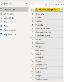
PRODUCT LIST
The list of all the products.
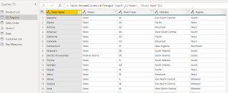
US REGIONS
All the US regions
SALES ORDER
The important table that we will use for our decomposition tree visual
DATE TABLE
The date table
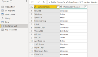
CUSTOMER LIST
The list of customers.
- How
our base measure which is sales is affected for the specific states,
month-wise, how much we have orders we have received for each
state for different products.
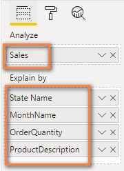
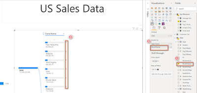
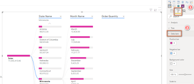
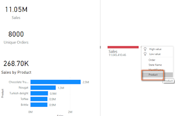
- Drag
the Decomposition Tree Visual and from the Sales measure.
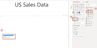
- Drag
the State name from US Region table
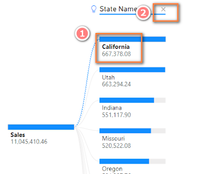
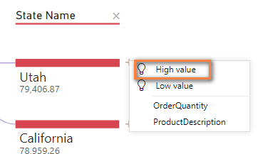
- When
you click on the + icon, you can see the High and Low value
for the state name.
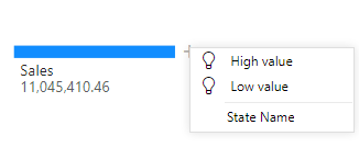
- Click
on High Value, you can see California is the highest followed by
Utah state.
- Click
on Low Value, you can see New Hampshire has the lowest sale
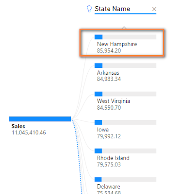
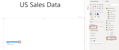
- Let's
add more dimension to the Sales measure to analyze more like Month
Name.
- Add
Order Quantity from Sales Order table to the visual.
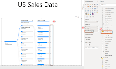
- Add
Product Description from Product list table
- You
can format the visual by adjusting Data bars under Format tab as
shown:
- Under
the Format tab, there is something called an AI split.
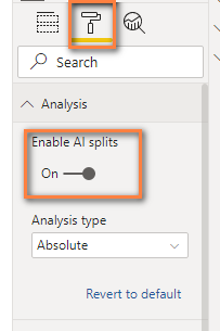
It
is one of the most parts of this visual that not only gives the analysis for
different dimensions but also the dimensions that gave a serious impact on my Sales
measure.
- Let's
perform analysis as the end-user. The Sales team wants to see how they
sold items monthly.
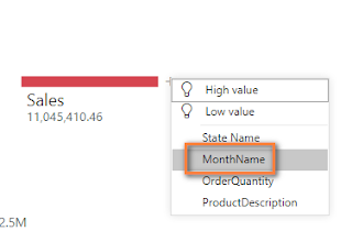
and
within milliseconds, we can see the month-wise split of the sales so easily.
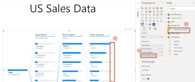
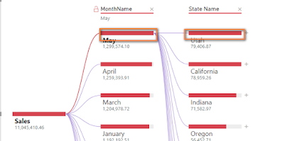
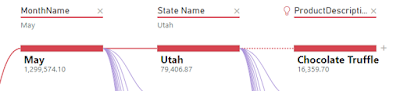
Next,
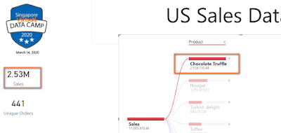
we want to check for a specific month say May, how much we sold in all
the state.

and
we found that in May, we sold many sales in Utah state
-
- Check
what are the maximum items were sold for Utah state, you can click on
High-value option
- we
can see Chocolate Truffle was sold the maximum in Utah state for May
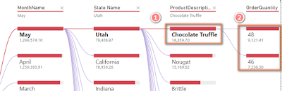
- The
number of orders for Chocolate Truffle is 48 and 46.
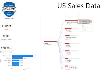
- You
can close the decision tree and start from another analysis
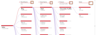
- And
Start from Product instead of the month.
- As
you see, Chocolate Truffle has the highest sales of decomposition
tree and overall sales figures
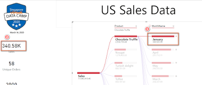
- You
can do further analysis to check what is the highest value in January
- and
you can see in January we sold 340.5K Chocolate truffles.
Visual InputsAnalyze – metrics to analyzeExplain By: one or more dimensions you would like to drill down into.
AI splits
High Value: the highest value of the measure being analyzed.
Low Value: the lowest value of the measure being analyzed.

You are the Project Manager who is US sales for all the states for specific months and products.
PRODUCT LIST
The list of all the products.

US REGIONS
All the US regions

SALES ORDER
The important table that we will use for our decomposition tree visual

DATE TABLE
The date table

CUSTOMER LIST
The list of customers.


It is one of the most parts of this visual that not only gives the analysis for different dimensions but also the dimensions that gave a serious impact on my Sales measure.

and within milliseconds, we can see the month-wise split of the sales so easily.
Next, we want to check for a specific month say May, how much we sold in all the state.

and we found that in May, we sold many sales in Utah state


No comments:
Post a Comment