Monday, March 4, 2019

Telling a story with your data and Power BI

As a data analyst, all our work starts and ends with a story. Now, storytelling with data is a skill that each data professional needs to master. Otherwise, it will a missing link in delivery insights to the executives, the management and other stakeholders.
   
WHY STORIES MATTER?


When you tell a story, you spark a connection.
That is how humans have communicated since the beginning of time —by telling stories.

WHAT IS STORY? 


A story is an EXPERIENCE of human transformation. Stories are HUMAN. Stories MUST have People; Your data is NOT HUMAN. A story is NOT a process and things you do. It’s not marketing buzzwords. Stories are a much simpler thing.

1)      CONNECT: with another human being. In a world where people are overwhelmed with information. Our brains and constantly trying to filter through the noise.

Your ability to open the door, get into the brain and in the mind of someone else very, very powerful.


2)      TRANSFER KNOWLEDGE: in a way that STICKS.

3)      WINS HEARTS AND MINDS:  Way to influence what people THINK, FEEL and DO.  Stories win hearts and minds change what people do.

DATA IS INERT


The problem that we have with data, is the data is fundamentally inert, and has no real meaning or value until you give it meaning and value. Storytelling is the most powerful way to do that.
Effective storytelling creates emotional and intellectual engagement like no other form of presentation.

STORIES & SCIENCE

Take a quick look at what happens in the brains of people that are suffering through a boring day of with meetings and emails. 


2 parts of the brain are activated.
1)      Broca’s area for Language Processing and Speech and

2)      other is Wernicke Area for Language Comprehension. Other parts of Brain is completely shut down and does not stick to long-term memory. 
However, IT professionals and Students become accustomed to.

It’s not the Brain’s preferred state. 


What we know from brain scans, and other research is that when a story gets told, the brain lights up. Brain suddenly becomes very much like the brain of a person in physical motion. New Brain is the parts that are associated with physical motion like moving, running, feeling, actually being sensory.

Visual Analytics


A visualization and icons are merely a vehicle. Actions require storytelling resides in short-time memory. Emotions and benefits are deep inside long-term memory. 

WHEN DATA IS USEFUL

The data is ONLY useful when we can easily ACCESS it, UNDERSTAND it and take ACTION from the data.

5 TIPS FOR DATA VISUALIZATION

1.       Always ask your data and apply the SO WHAT Test.

2.       Context, Context, and Context.
If we demonstrate a data story to the IT department, the Finance department may could not understand it completely. Therefore, while designing data story always keep in mind of the audience that you are targeting.

3.       Also, show trends.

4.       Always choose Right Visuals.

5.       Make your Visuals spacious and planned.


WHAT ENTAILS IN A BUSINESS INTELLIGENCE PROJECT.

Working with data and business Intelligent projects typically require huge effort and time. You can visualize it is as an Iceberg.


1. Find – not always available. May have to talk to another vendor who is managing the client data.
2. Access – PBI has many connectors and you can create your own connector.
3. Clean- You have to clean it which is very important of data project. 
4. Model – make your data model and data can come from different data sources.
5. Calculations - based on your data model, you develop DAX calculations. 
6. Visuals - Create the Visuals based on business requirements.
7. Branding and Design: (most important aspect) – Make dashboards and reports beautiful and appealing.

However only 20% matters for the audience or the clients i.e. VISUALS and BRANDING & DESIGNS


DATA STORIES
Power BI team has created an amazing data stories that can use for your own data stories.


This dashboard provides a 360-degree view of overall store sales performance. Strategic users can use it to quickly check KPIs with respect to different attributes.

This is easy to understand, clean and very powerful dashboard.


The facts have been presented time and again, year after year, for decades and yet there is still an astounding level of willful ignorance and inaction from the people who should be doing the most to protect us and every other living thing on this planet. Here are the facts, one more time.

The dashboard uses multiple pages, and leverage bookmarks to create a navigation experience through independent topics. The dashboard has a storyline strong. The bookmarks feature was of great help in this case. It kept the story alive and also made navigation easy.


The Microsoft Office team recently partnered with Levo, a network for millennials in the workplace to help navigate their career paths, to poll 1,500 community members to find out more about their productivity habits and challenges for the “Mastering your productivity in 2017” survey. The Office team was looking for an engaging way to share Levo’s findings with the media – one approach they took was to use Microsoft Power BI to produce an interactive and compelling report from the data.

4.       Sales Summary


This dashboard shows all the US Sales for based on total sales, total units sold, unique orders and average. The donuts charts provide different metrics for the audience.

The slicer on the top helps sales and key stakeholders’ years as well as by months. The Dashboard used icons and easy to read the title which makes it more impactful.

KEY TAKEAWAYS

1.       Does your dashboard lead to take some action?

2.       Have your users learned something new from your data?

3.       Do your users understand it in 30 seconds?  

References:
1.       eDX Course Analytics Storytelling for Impact
2.       curbal.com presentation on storytelling. Source  


Wednesday, February 20, 2019

How to: Use DocuSign Actions within Nintex Workflow for Office 365.

Hi All,

I have written a blog about  how to use DocuSign Actions within Nintex Workflow for Office 365.

Here is the link.

Hope you enjoy.

--aaroh

How to: Update Office 365 Nintex Forms and Workflow Apps

Hi All,

I had written a blog an issue when I was troubleshooting Nintex Apps for Office 365.
Here is the link.

Hope you enjoy.

--aaroh

How to: Use Document Generation with Adobe Sign actions within Nintex Workflow for Office 365

Hi Everyone,

I had written a blog post how to use Nintex document generation leveraging Adobe Sign.
Here is the link.

Hope you enjoy.

--aaroh 

Sunday, January 14, 2018

How to: Use cascading drop-down lists in PowerApps

Hi all,


Using cascading dropdown, users can easily fill the forms by selecting drop-down values dependent on values from another dropdown list.

For e.g.   you can select a country as dropdown and depend on the country value you will filter all states which are selected from the specific country. Using this approach, the process becomes quicker and easier for the end user.

You can perform the same in PowerApps very easily.

Here are the steps:
  1. Data Sources:


    You need to use 2 lists to achieve this functionality and use a lookup field.
    1st is our main Issue List called IssueLog and another list is Zones lists  as shown:

    Issue Log Data Structure


    Issue Log Data 


    Zone Data Structure 


    Zone Data 


    2. To add a cascading drop down functionality, we need to add a connection to Zone list.


    and connect to another list


    and connect to Zone list.


    3. Add Custom Card.


    Click on EditForm, and you can see Issue Log Data.
    In the Fields panel, click on the ellipsis (…) and click on the “Add a custom card” as shown:


    4. Adding Dropdown lists

    In this custom data card, add two drop-down lists within this data card.

    >> Rename to ddlZones
    >> Rename to ddlSubcodes


    5. For the Zone drop-down list, set the Item properties to Distinct(Zones, Title)


    6. For the SubZone drop-down list, set the Item properties to Filter(Zones, Title= ddlZones.Selected.Value).SubCode 


    7. Test the Cascading Dropdown lists.


    I hope it this post helped you.


Sunday, January 7, 2018

How to: Use variables in PowerApps.

Hi All, 
I am testing how could I perform the sort functionality    in MY CUSTOM APP which is readily available on SharePoint Online. 

PowerApps team already defines some variables specially for SharePoint integration. PowerApps has an amazing documentation about understanding variables.

Let’s dissect how the sorting functions for SharePoint App.


Open PowerApps Studio, click on New >> SharePoint > choose Phone Layout.


Choose a Phone layout as shown:


If you click on the sort icon, there is OnSelect property with formula UpdateContext({SortDescending1: !SortDescending1}) which already defines.


Navigate to File >> Variables. You can see a Boolean variable called SortDescending1


where this variable is used.


You can simulate in your own custom app.

Step1: Create an App

Create a new PowerApps studio by navigating to New >> choose Blank app and choose Phone Layout.


You create a sample excel sheet as our data source.  In the New connection >> Add static data to your app and locate your Excel sheet. 


Step2: Choose a data source.

You create a sample excel sheet as our data source.  In the New connection >> Add static data to your app and locate your Excel sheet

. 

Step3: From Insert tab, click on Gallery Control. Also add Sort Icon from the Icons control.


Step4: Click on Sort Icon

Use the formula in the formula bar as shown
UpdateContext({MySortOrder: !MySortOrder})


Step5: New Variable

Now, you can view a new variable in the Variable section of PowerApps Studio.


Step6: Gallery’s Items Property

You need to set this formula in the Item’s property as follows:
SortByColumns(Search(SpecialistAllocation,txtSearch.Text,"Title"),"Title", If(MySortOrder, SortOrder.Descending, SortOrder.Ascending))


Step7: Test

You can click on Preview and test the Sort functionality


I hope this post helped you!

Monday, January 1, 2018

How to: Create an Expense claim end-to-end solution using PowerApps on SharePoint Online.


Hi All,

I am working on PowerApps for couple of days and specifically for SharePoint Online. I have worked with other 3rd party Forms and Workflows for more than a year. But learning new tools and techniques are always beneficial for customers who do not want to shell out a fortune for 3rd party apps or have lower budget for designing business applications.

So why you care for PowerApps?

 In short, it turns your business solutions with ease, and business SOFTWARE need NOT to be hard. We can work anywhere, anytime and on any device.  Furthermore, there is no business app that is “complete”. Thus, customer have only two options either BUY or BUILD.

But what about we EXTEND the stuff that we ALREADY use? A lot of custom solutions by partners are around Microsoft applications such as Excel, Visual Basic, Access, SharePoint, InfoPath to fill the gap. But it poses a big challenge and they are

·         Not Cloud-first.
·         Not addressable for multiple devices i.e. cross-platform
·         Not CONNECTED to our other data sources.
·         Not Centrally manageable.
·         At end, we need to engage a developer to write custom code.

PowerApps addresses these challenges. Below are the benefits

1.       Easy Authoring

Provides a truly WYSIWYG designer with complete control over user experience. 

Creates app logic with familiar Excel-like expressions.

Mash up data from multiple sources right at the app level.


2.      
Connected

Common data service (CDS)
provides a rich platform and standard model that gets creators instantly productive.

CDC connects to Dynamics 365, Office 365, Flow, Power BI natively and many connectors/gateways. We have option development extensibility as well.


            Has around 160+ connected data sources.

           Add custom connectors and on-premises sources. 


3.       Cross Platform

We can publish apps instantly iOS, Android,Windows, and the web.

Sharing apps is like sharing documents.

Manage across environments.


4.       Enterprise Ready

Centrally view app telemetry and manage apps

Able to set DLP policy on data and connectors.

Compliance with 13+ standards including HIPAA, EU Model Clauses and SOC


5.       Pro Developers and integration    

Build apps that go beyond that you get in the box.

Build reusable custom app components and connectors.

Leverage full power of azure capabilities. 


Eventually, we get highly scalable platform. If the problem gets more complex, solution gets more complex, we don’t need to reach to developer.


 This blog post is about a typical custom app for Expense Claim and data source is SharePoint Online. We could have different flavors such as vacation requests, travel requests or sales order-line items etc.

 We will see the topics such as Gallery, Forms, DataTable, conditional formatting, and REPEATING DATA ENTRIES
Developing PowerApps for SharePoint
We can customize PowerApps leveraging two options: 

a) SharePoint list embedded forms
 

Recently (Q4 2017) PowerApps team has added customization forms option in the SharePoint List as follow:


When you create an item, you can customize form


You can also navigate to List Settings >> Form Settings


>> It has to be noted that at this point of time (31 Dec 2017), there is NO mobile PowerApps available via SharePoint customized form.

>> You cannot import / export SharePoint customized forms from one environment to another.  

So, you have to create a separate custom app for mobile phone via Create an app option for the mobile phone.

Embedded forms are special kind of PowerApps and its directly tied to the SharePoint list.  PowerApps Controls have simple types such as buttons, drop down, date picker etc.  and also have complex types such as choice, people picker, lookups etc.  


b) Create an app

In this option, you can create a custom PowerApps app and can be used for mobile devices. In this example, we will create a PowerApps desktop client to build this Expense claim form.

During developing the PowerApps desktop client, I found that its much slower its browsers based counterpart (https://web.powerapps.com/ )


DATA STRUCTURE FOR THE SOLUTION

We will have two custom lists.

i) One list will record all the Expense items such as Purpose, Amount, Start and End date, Approver etc.


ii) Second list will have Expense Details with Expense title as a lookup field


Develop Expense Claim App via PowerApps Desktop client.

·         Create a New >> Tablet Layout via PowerApps Desktop client


·         On the PowerApps designing canvas, click on the connect to data.  New Data panel will show up. Click on “New connection” and choose your data source. In our example, its SharePoint Online. Select your Microsoft/Office 365 account.


·         You need to specific SharePoint URL:


·         You can search and select for Expense lists and click on Connect


·         Now, both the lists are connected to our data source. You can have as many lists in the solution.


·         Blank vertical from Gallery 


Gallery control  is PowerApps control that helps in editing the template, shows multiple records of data source and each record can contain multiple controls.  

·         Name and Save the app


·         Create a rectangle (Icons) from the insert ribbon.


·         Drag and drop label on the rectangle and color the label white.  


·         Connect the data, select the Expense list 


As layout is Blank, we can choose “Title, subtitle, and body


·         Gallery throws a bunch of defaults. We can easily choose correct values from the Expense list which we can change easily:


·         Click on Gallery and you can view the Pencil icon. Under layout, you can alter which field you like to display:


·         We make title as first entry in our form:


·         In the Body section we want to display “ApprovalStatus” which is part of Expense list. But, in the PowerApps, you can’t see the Approval Status. The reason is that Approval Status is a choice field and a complex type in the context of PowerApps. 


So, we have to manually type formula use Value as shown below


·         We can also append $ value, the same as we did in excel.


·         We also apply border and color for our gallery.


GALLERY WITH SEARCH
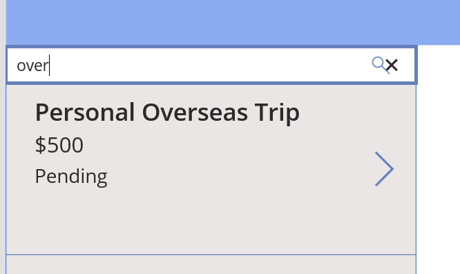
·         We can perform a search by applying filter for our Expense list and bind to our gallery control. To do so, we create text box, add search icon and in the formula, add this formula  to our gallery


  Note:  Please always give meaningful and descriptive name of the PowerApps controls.

·         Let’s Preview our search by clicking on “Play” icon


and our search results are coming through nicely.


ADDING DATATABLE TO POWERAPPS

·         DataTable Control

Shows data set information in a tabular view. You customize column width, header text, color. Currently it has read only view.

Click on the Data table from Insert tab.  The Data table will display Data panel as well.


·         From the Data panel, select the Expense Details list


·         Select the fields that you want to display in the DataTable.


All the selected columns are now available in our DataTable


However, we are getting all the entries from Expense Details in this DataTable.
Now, we need to filter only for specific entries from the Expense list only such as Australia Visit, Personal Overseas Trip etc.

To achieve this, we need to follow steps
·         Click on “>” and set the Visible property to ThisItem.IsSelected


·         Click on the “ExpenseDetailsDataTable1” and apply following filter Filter(ExpenseDetails, ExpenseDetails.Value = ExpenseGallery1.Selected.Title)


Now, we are able to get each expense item expense individually from the Expense Details list.
We have completed master details scenarios.


·         We will add a pie chart for each expense item. Copy and Paste rectangle and change the background


·         Pie Chart shows some sample data. We can attach our Expense information to this pie chart. Click on the “ExpensePieChart” and  in the formula bar set this value ShowColumns(ExpenseDetails, "Category", "Amount")


But this pie chart shows all the expense for each expense item. We need to filter for each expense item for pie chart.

·         For “ExpenseDetailsDataTable” copy the formula Filter(ExpenseDetails, ExpenseDetails.Value = ExpenseGallery1.Selected.Title) and place to our pie chart ShowColumns(Filter(ExpenseDetails, ExpenseDetails.Value = ExpenseGallery1.Selected.Title), "Category", "Amount")


Let’s Preview this


It’s pretty fast and snappy.


·         We can add some labels near pie chart.


ADDING FORM TO POWERAPPS

·         View, Edit, Create new record for a Data Source. The type is set using FormMode.   Item property shows the specific record of the data source. Magic happens when you set Form.Item = Gallery.Selected


·         We rename our first screen to HomeScreen and add a PLUS icon

·         Next, we add a new screen by clicking on New Screen and choose blank screen


name it to NewScreen


·         From Insert tab go to Forms >> Edit Form option and from the Data panel select the Expense list.


·         Check ONLY necessary columns from the Expense list. 


·         Rearrange the columns by choosing 4 layouts by checking Snap to columns


·         Copy the Rectangle that we create in HomeScreen and paste to NewScreen and change label to New Expense.


·         Next, we add a button “Add New Expense” button, and form should submit in the Formula bar: SubmitForm(ExpenseForm)  


·         Navigate to the HomeScreen, click on the + icon and in the formula bar add these functions:
Navigate(NewScreen,ScreenTransition.Fade);NewForm(ExpenseForm)


ADDING REPEATING SECTION FOR EXPENSE FORM
·         In new form, we should be adding multiple entries for user to fill in. This Expense information will be captured in the Expense Details list.

We add a DataTable to achieve that. We already created a DataTable in the HomeScreen. So, we can simply copy and paste that DataTable to our ExpenseForm in the New Screen.


  But this the old formula which we copied from HomeScreen DataTable. We need to fill other formula as shown:


·         Add more Edit Form below our DataTable and bind to Expense Details list


Bind only necessary columns that needs to be displayed. 

·         Copy and Paste “Add New Details” below Edit Form. Name the buttons “Add New” and “Done


·         For the Add New button, we will add following formulas


Refresh function gets the latest copy of the data source.  

·         For the Add Expense Details, we will add following formulas


·         For the Done button, we will simply navigate to the HomeScreen


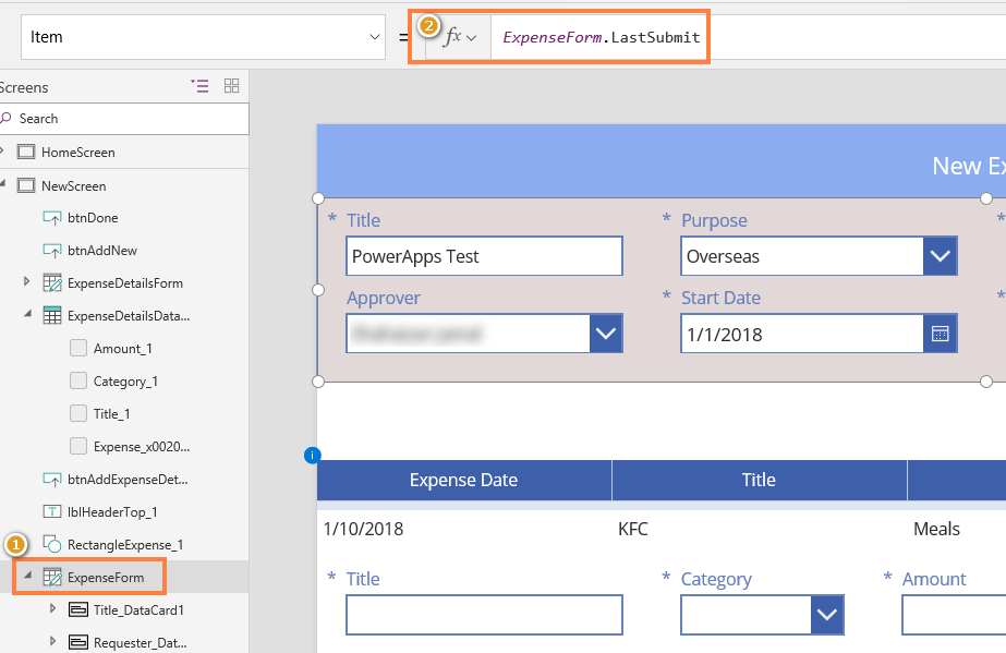
·         Set the Item property

We need to set the Item property for the Expense Form.


·         Verify if user has submitted the New Screen


·         Verify if the form is Edit mode or View mode


·         Test the App

Add new expense by clicking “+” icon and append multiple entries as shown:


We can view the entry at Home Screen.


·         CONDITIONAL FORMATTING


·         We can use Color property to control the text color control and use Fill property for fill color.

We can also set one or more conditions based on state of the app or control or variable.  


I hope this blog post helped. 


References:

2.       Formulas Reference  

3.       Tables and Records

4.       Gallery Control

5.       DataTable Control

6.       Refresh Function


Low Code Reimagined with AI + Copilot Pitch Deck - Copy Copilot day (Virtual) - 2023

 Hi All,  I presneded a session at Pune UG on Low Code Reimagined with AI + Copilot Pitch Deck.  Video is at this address  https://www.youtu...