Saturday, April 27, 2019

How to use real-time data in Power BI using Microsoft Flow


Using Microsoft flow and Power Automate we can easily use Power BI Real-time data sets. What is required is as follows:


1.       An Office 365 free 30-days trial or subscription.
2.       Microsoft Flow
3.       Microsoft Flow
4.       Power BI Free or Pro edition.

What is our Business scenario?


Contoso Inc wants to hold an event and sends 1000 participants a simple digital survey. They ask about 3 questions i. What Microsoft TECHNOLOGY they are interested in, the number of years of EXPERIENCE they have in that technology and the LOCATION they are from.

Contoso wants REAL-TIME dashboard whenever any participant submits the survey.  Specifically, Contoso wants the COUNTRY they are from, and participants their number of EXPERIENCE.

The technology we can use to achieve this requirement

We can use MICROSOFT FORM to capture digital form. The Microsoft Flow which will process our questions in the Microsoft flow. Next,  we can use set up Power BI Push dataset and use Power Visuals to achieve this.

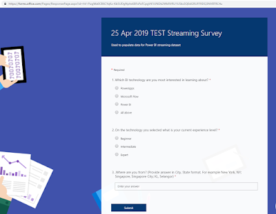
This is a sample of our Microsoft Form 

Step1: Start Microsoft Flow

  1. Microsoft Flow has many templates that we can leverage.

    for our case, we will create Flow from scratch
  2. Create from blank 
  3. Click on Create from blank

  4. We will choose Microsoft Forms as our Trigger in the Flow.


  5. It will limit me the number of actions and trigger which are available to our disposal.
  6. We have only ONE trigger which is nice. Click on “When a new response is submitted”.


  7. As I have single sign-on turned on, I will be presented with Form ID. Choose the Form which I have created

  8. Next, click on New step

  9. It is storing all the information as an array within Flow. When a person submits the form, it will be a trigger.  So, if Alex submits the 3 questions in the survey, Flow will process all the 3 questions in the “Get response details” action.

  10. Select the Form which we created in the previous step and in the “Response Id”, under the Dynamic content select the List of response notifications Response Id


  11. Now it has created some new elements and each response is wrapped by for each loop.

    Step 2: Streaming Data using Power BI

  12. Go to Power BI and created a new app workspace. Name it as 25 Apr 2019 Streaming Data set Demo. It won't have any dashboards, reports, etc.

  13. This is the landing page.  Click on the Skip

  14. Click on Create option and then click on Streaming dataset.

  15. We will leverage API and click NEXT

  16. Now it has Power BI has a very intuitive user interface (UI) which just enter the values. Types the values as follows

    Technology, Experience, and Location.

    Toggle ON for Historical data analysis

  17. A new dataset has been created.

  18. It has the same look and feel just like your Power BI Desktop.

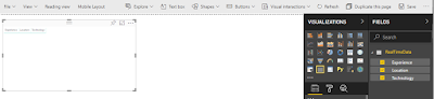
  19. Firstly, we will create a table visual here.

  20. Drag all the fields to the table.


  21. Bump the column headers and Value size.


  22. Make alternate rows in Style property

  23. Turn off Total


  24. Drag the MAP visual and alight towards the top right.

  25. Drag Location field onto the Location property of the map.

  26.  Drag the Technology field onto the Legend property of the map.

  27. And finally, drag Experience field onto Size property of the map.

  28. The last chart is stacked column chart and drags it to report canvas.

  29. Drag Technology onto Axis property, Experience onto Legend property and Experience onto Size property.

     
  30. Save the report as 25 Apr 2019 Survey Response

     
  31. Next, pin the visuals individually to Dashboard 
  32. Do the same for TWO more visuals.
  33. Now, our Dashboard is ready.

  34. Note that Streaming and Pubnub works only for custom streaming data as shown.


    and we can’t use ANY of the visual that we are doing for this example

    Step 3: Complete the Flow 

  35. Click on Add an action in Flow just below the  When a new response is a submitted trigger


  36. Next, Add rows to a data action


  37. Choose appropriate workspace

  38. Select the Dataset

  39. The table will be RealTimeData.
  40. Next, Flow dynamically shows the Forms data fields.


  41. From Technology data field, choose the appropriate item from MS Forms.

  42. Select other Form fields as shown:

  43. Click on SAVE button on the Flow and you will see the Run History when people are submitting the MS form data.


    Step 4: View the Power BI Dashboard

  44. Dashboard display real-time data when anyone submits a form

  45. The report can be refreshed by using a Schedule.


    Hope you find this blog post useful 
--Aroh Shukla 


Monday, March 4, 2019

Telling a story with your data and Power BI

As a data analyst, all our work starts and ends with a story. Now, storytelling with data is a skill that each data professional needs to master. Otherwise, it will a missing link in delivery insights to the executives, the management and other stakeholders.
   
WHY STORIES MATTER?


When you tell a story, you spark a connection.
That is how humans have communicated since the beginning of time —by telling stories.

WHAT IS STORY? 


A story is an EXPERIENCE of human transformation. Stories are HUMAN. Stories MUST have People; Your data is NOT HUMAN. A story is NOT a process and things you do. It’s not marketing buzzwords. Stories are a much simpler thing.

1)      CONNECT: with another human being. In a world where people are overwhelmed with information. Our brains and constantly trying to filter through the noise.

Your ability to open the door, get into the brain and in the mind of someone else very, very powerful.


2)      TRANSFER KNOWLEDGE: in a way that STICKS.

3)      WINS HEARTS AND MINDS:  Way to influence what people THINK, FEEL and DO.  Stories win hearts and minds change what people do.

DATA IS INERT


The problem that we have with data, is the data is fundamentally inert, and has no real meaning or value until you give it meaning and value. Storytelling is the most powerful way to do that.
Effective storytelling creates emotional and intellectual engagement like no other form of presentation.

STORIES & SCIENCE

Take a quick look at what happens in the brains of people that are suffering through a boring day of with meetings and emails. 


2 parts of the brain are activated.
1)      Broca’s area for Language Processing and Speech and

2)      other is Wernicke Area for Language Comprehension. Other parts of Brain is completely shut down and does not stick to long-term memory. 
However, IT professionals and Students become accustomed to.

It’s not the Brain’s preferred state. 


What we know from brain scans, and other research is that when a story gets told, the brain lights up. Brain suddenly becomes very much like the brain of a person in physical motion. New Brain is the parts that are associated with physical motion like moving, running, feeling, actually being sensory.

Visual Analytics


A visualization and icons are merely a vehicle. Actions require storytelling resides in short-time memory. Emotions and benefits are deep inside long-term memory. 

WHEN DATA IS USEFUL

The data is ONLY useful when we can easily ACCESS it, UNDERSTAND it and take ACTION from the data.

5 TIPS FOR DATA VISUALIZATION

1.       Always ask your data and apply the SO WHAT Test.

2.       Context, Context, and Context.
If we demonstrate a data story to the IT department, the Finance department may could not understand it completely. Therefore, while designing data story always keep in mind of the audience that you are targeting.

3.       Also, show trends.

4.       Always choose Right Visuals.

5.       Make your Visuals spacious and planned.


WHAT ENTAILS IN A BUSINESS INTELLIGENCE PROJECT.

Working with data and business Intelligent projects typically require huge effort and time. You can visualize it is as an Iceberg.


1. Find – not always available. May have to talk to another vendor who is managing the client data.
2. Access – PBI has many connectors and you can create your own connector.
3. Clean- You have to clean it which is very important of data project. 
4. Model – make your data model and data can come from different data sources.
5. Calculations - based on your data model, you develop DAX calculations. 
6. Visuals - Create the Visuals based on business requirements.
7. Branding and Design: (most important aspect) – Make dashboards and reports beautiful and appealing.

However only 20% matters for the audience or the clients i.e. VISUALS and BRANDING & DESIGNS


DATA STORIES
Power BI team has created an amazing data stories that can use for your own data stories.


This dashboard provides a 360-degree view of overall store sales performance. Strategic users can use it to quickly check KPIs with respect to different attributes.

This is easy to understand, clean and very powerful dashboard.


The facts have been presented time and again, year after year, for decades and yet there is still an astounding level of willful ignorance and inaction from the people who should be doing the most to protect us and every other living thing on this planet. Here are the facts, one more time.

The dashboard uses multiple pages, and leverage bookmarks to create a navigation experience through independent topics. The dashboard has a storyline strong. The bookmarks feature was of great help in this case. It kept the story alive and also made navigation easy.


The Microsoft Office team recently partnered with Levo, a network for millennials in the workplace to help navigate their career paths, to poll 1,500 community members to find out more about their productivity habits and challenges for the “Mastering your productivity in 2017” survey. The Office team was looking for an engaging way to share Levo’s findings with the media – one approach they took was to use Microsoft Power BI to produce an interactive and compelling report from the data.

4.       Sales Summary


This dashboard shows all the US Sales for based on total sales, total units sold, unique orders and average. The donuts charts provide different metrics for the audience.

The slicer on the top helps sales and key stakeholders’ years as well as by months. The Dashboard used icons and easy to read the title which makes it more impactful.

KEY TAKEAWAYS

1.       Does your dashboard lead to take some action?

2.       Have your users learned something new from your data?

3.       Do your users understand it in 30 seconds?  

References:
1.       eDX Course Analytics Storytelling for Impact
2.       curbal.com presentation on storytelling. Source  


Wednesday, February 20, 2019

How to: Use DocuSign Actions within Nintex Workflow for Office 365.

Hi All,

I have written a blog about  how to use DocuSign Actions within Nintex Workflow for Office 365.

Here is the link.

Hope you enjoy.

--aaroh

How to: Update Office 365 Nintex Forms and Workflow Apps

Hi All,

I had written a blog an issue when I was troubleshooting Nintex Apps for Office 365.
Here is the link.

Hope you enjoy.

--aaroh

How to: Use Document Generation with Adobe Sign actions within Nintex Workflow for Office 365

Hi Everyone,

I had written a blog post how to use Nintex document generation leveraging Adobe Sign.
Here is the link.

Hope you enjoy.

--aaroh 

Low Code Reimagined with AI + Copilot Pitch Deck - Copy Copilot day (Virtual) - 2023

 Hi All,  I presneded a session at Pune UG on Low Code Reimagined with AI + Copilot Pitch Deck.  Video is at this address  https://www.youtu...